

Interaction Design
Munchies
Childhood obesity poses a profound impact on both the physical and psychological well-being of a child. Early-onset obesity increases the likelihood of persistent weight issues into adulthood, accompanied by a heightened risk of weight-related ailments like diabetes and cardiovascular diseases. Among the causes contributing to childhood obesity, misinformation regarding healthy eating stands out as a key factor. This project aims to provide a solution by supplying children with helpful information regarding healthy eating habits in a fun an interactive way.


challenge, concept & solution.
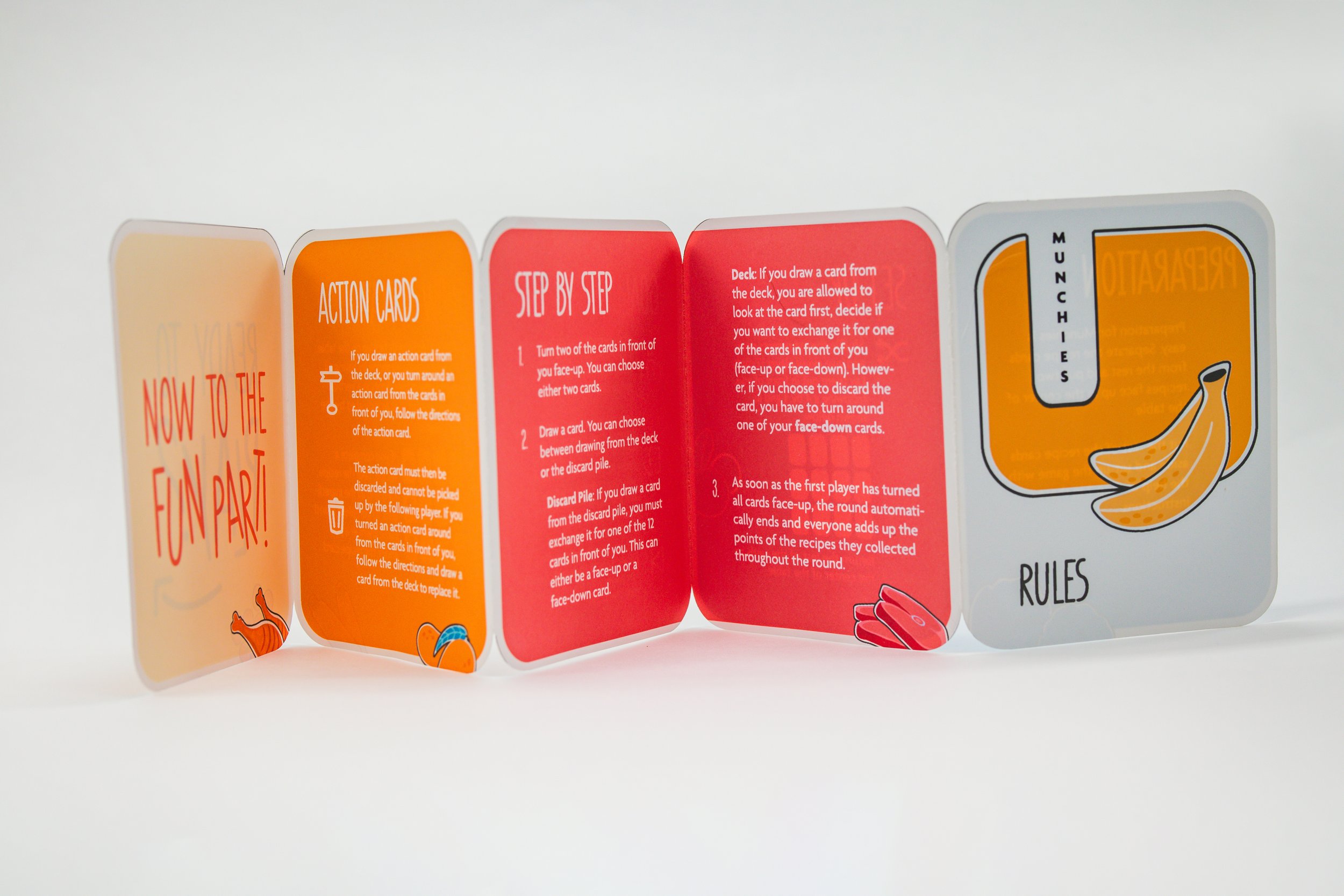
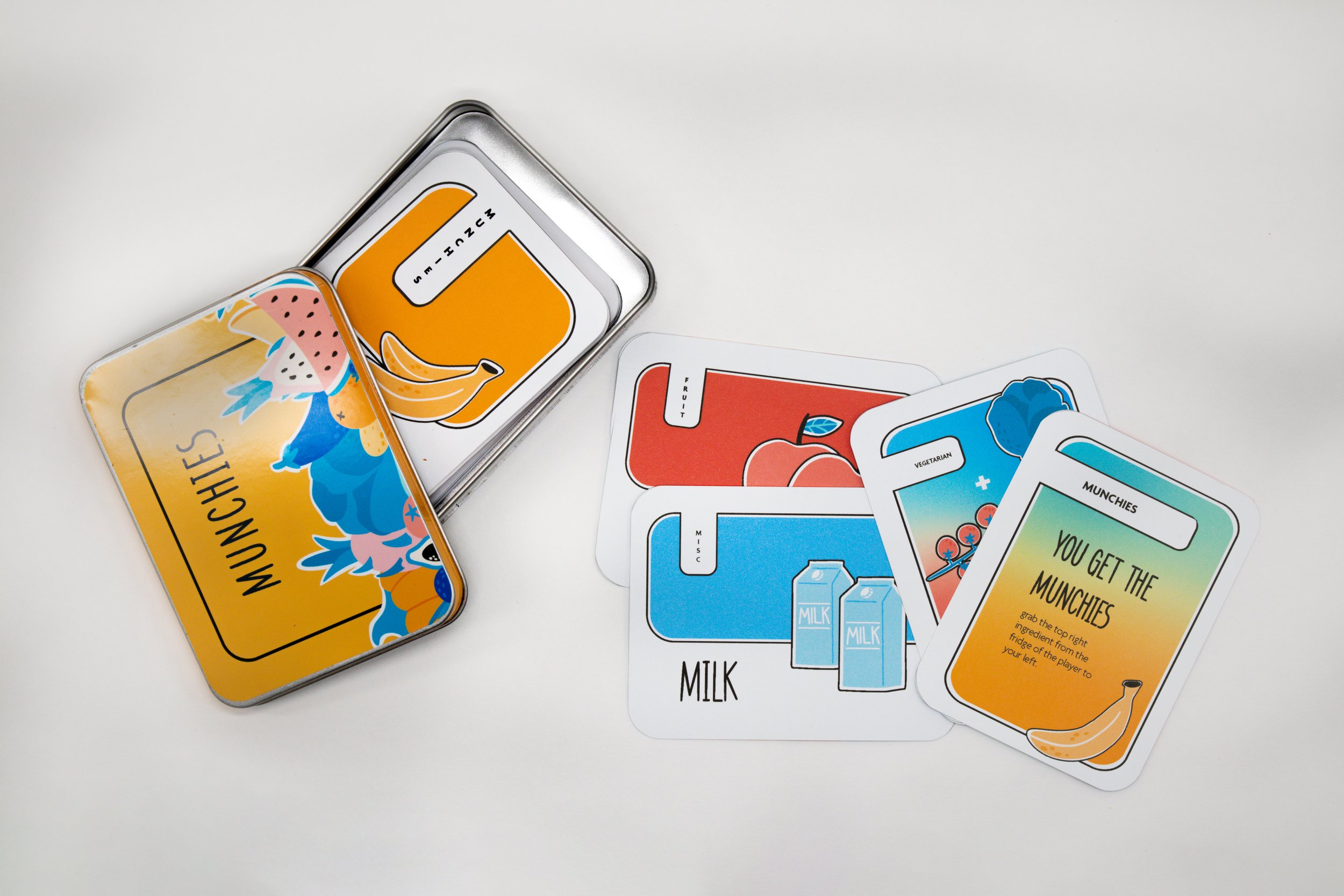
Created to tackle a social issue, Munchies is a dynamic and educational card game for children, promoting healthy eating habits. Players strategically combine ingredient cards to build nutritious recipes in vertical rows, adding excitement with action cards.
The scope of the project involved addressing a social issue, researching existing games, defining a target audience, creating a game concept and rules, conducting three playtests for iterative refinement of the game design, and lastly the design and physical production of the box, cards, and the rule book.
Research &
art direction
problem statement
Childhood obesity in the United States is concerning, affecting around 13% of children aged two to six. Globally, obesity rates have almost tripled since 1975, as reported by the World Health Organization. This trend is especially alarming in countries where the combined impact of overweight and obesity exceeds mortality rates linked to underweight conditions, highlighting a critical issue requiring urgent attention and intervention.
target group
"Munchies" targets children aged 6-10 from low to medium-income backgrounds, interested in books, sports, animals, and food. Due to limited resources, they lack access to information about healthy eating. In their environment opting for fast food appears more accessible than acquiring knowledge about healthier alternatives. The game aims to provide a positive learning experience, hoping to impact their understanding of nutrition and encourage healthier food choices.
paper prototypes & playtests
Creating a paper prototype and conducting playtests were crucial to ensure the game is playable, fun, and educational. The detailed prototype served as the initial representation of the game's mechanics. Through a series of playtests, I gathered feedback to refine and enhance the game, making iterative adjustments to address identified issues and areas for improvement.
typeface & colors
I chose the vibrant "Apparatus" typeface and a lively color palette to enhance the visual appeal of the children's card game. The colors capture attention and create a playful atmosphere, crucial for an education-focused game. The typeface strikes a balance between readability and whimsy, with clean lines for young readers and a style reminiscent of childlike handwriting, resonating with the target audience.