

Branding & Packaging
Ricola
Recognized globally for their exceptional cough drop efficiency, Ricola boasts over 60 flavors, evolving beyond a mere remedy to a sugar-free treat. This project aims to capture the essence of Ricola's diverse identity, presenting a purposeful redesign that enhances both efficacy and flavor. Join me in exploring the strategic decisions and creative process behind reshaping Ricola's visual identity for a more resonant and engaging consumer experience. This rebranding initiative was undertaken as part of a coursework project within the framework of my degree program.


challenge, concept & solution.
As part of my coursework in the graphic design program at Weber State, I had the intriguing task of reimagining Ricola's logo and crafting a comprehensive brand book as well as create a unique packaging design. Although this endeavor is entirely fictional, it provided an opportunity akin to refining the profile of a trusted ally.
Ricola, renowned globally for relieving sore throats, has unintentionally become synonymous with winter. In addressing this perception, my proposal adopts a strategic and contemporary approach, preserving the medicinal essence while creating a year-round, accessible appeal.
At the core of Ricola's narrative is the commitment to sourcing premium-quality raw materials cultivated naturally in the Swiss mountains. Beyond its medicinal utility, Ricola aspires to embody a persona that is not merely remedial but also caring and comforting—providing a flavorful remedy for throat tickles.
This rebranding initiative aims to introduce a refined, professional aesthetic that aligns with Ricola's heritage, enhancing both its approachability and effectiveness. Simultaneously, it seeks to address Ricola’s seasonality issue, ensuring a more consistent presence throughout the year.
SWOT
strenghts
Ricola distinguishes itself through the exceptional quality of its drops. Notably, each drop is consistently sugar-free and crafted solely from natural ingredients. Setting itself apart in the market, Ricola stands as the sole brand offering a diverse range of over 60 flavors, reflecting a commitment to variety and excellence in the realm of throat remedies.
opportunities
The current packaging leans heavily towards a medicinal feel, designed for those feeling under the weather. A potential shift exists in framing Ricola as a delicious treat rather than just a cough drop. By emphasizing the array of flavors, we can reinforce the perception of Ricola as a healthier substitute for candies.
weaknesses
Ricola faces a notable challenge rooted in the seasonality of its product. The prevailing perception of Ricola primarily as a sore throat remedy confines its usage predominantly to the colder seasons. Additionally, Ricola contends with a pricing disparity, being positioned as a comparatively higher-cost option when compared to its market competitors.
threats
A shift in the current Ricola branding could cause long-term, older consumers to hesitate purchasing Ricola, potentially leading to a loss of confidence in its effectiveness as a cough drop.

the new logo
The redesigned Ricola logo, featuring a bold leaf, stands as a transformative statement that brings a modern and fresh perspective to the brand's visual identity. The abstracted leaf serves as a powerful symbol, encapsulating the essence of the natural ingredients inherent in Ricola drops. Simultaneously, its form cleverly echoes that of the classic oval shape of the Ricola drop, creating a harmonious blend of tradition and innovation, not only communicating the brand's commitment to natural goodness but also providing a contemporary aesthetic.

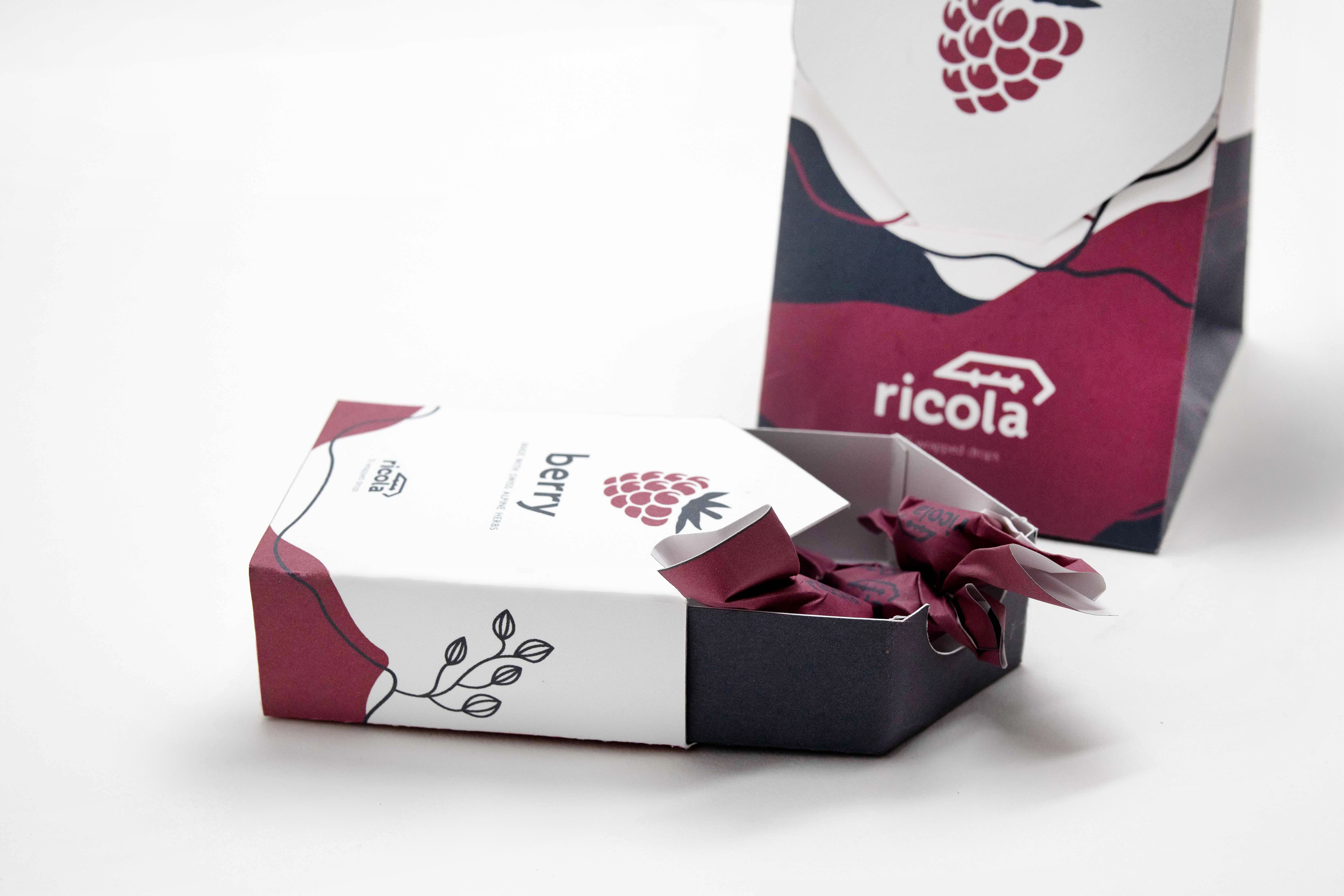
the new packaging
Recognizing that Ricola is not just a remedy for a sore throat but also a delicious treat suitable for any time, the redesign aimed to cater to the busy lifestyle by offering an on-the-go option while preserving the brand's visual identity. The solution involved creating two distinct packaging designs tailored for different uses: one for at-home consumption and another for on-the-go convenience. To emphasize the Swiss origins of Ricola, the illustration on the packaging captured the essence of "swissness" by subtly depicting abstract mountainscapes adorned with the finest herbs used in Ricola drops. The flow lines in the illustration not only added depth but also alluded to hiking map aesthetics, reinforcing the product's heritage and emphasizing the natural goodness within. The redesign aims to modernize the brand while maintaining its familiar elements, making it appealing to both new and existing customers.